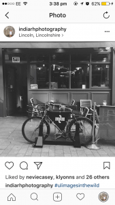
My image
This image is my favourite one that I took as part of the ‘appropriation’ title we were given. I think I like this one the most because of the slightly abstract interpretation of the title, not including any faces or people, and instead focused on the branding and furthermore creating a Parisian-looking image. This image also could have been taken within the 60’s, with the vintage-looking sign by the door.
What I also like about this image within the ‘appropriation’ context is the reflection of the Carluccio’s sign within the glass, representing two companies within this photo.
—————————-
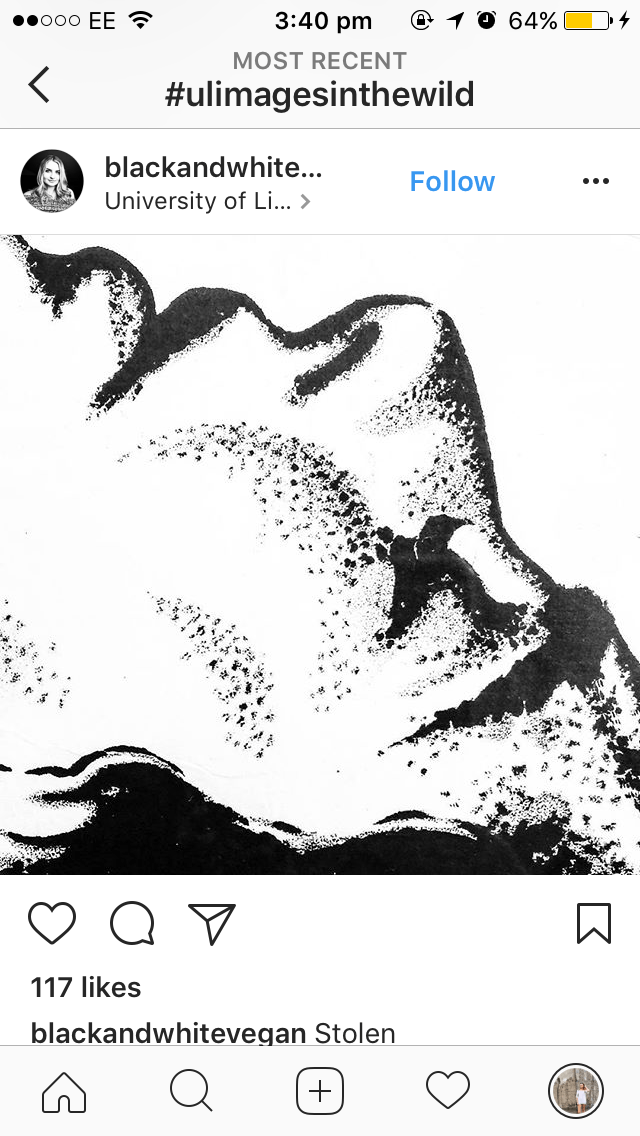
Image found on the hashtag
This image was one of my favourites from the Instagram hashtag #ULimagesinthewild. I like the idea of cropping the image out of its original context to create another one. It makes the viewer consider why the girl is there/ what she is doing.
Therefore this makes it a thought-provoking image as we question what is happening and even what the original advert was of. Having the image in black and white further makes it a stylish image, one which could be a poster within itself.